
7 Communicating Statistical Results
So far you’ve learned several ways to summarize data - shape, center, and spread of distributions, and form, strength, and direction of multivariable associations. Congrats, you’re doing statistics! Specifically, you are doing what is called descriptive statistics - calculating numbers that describe a sample of data.
However, there’s not much point to doing all that work if you can’t share the results with other people. Doing statistics well is important, but equally important is the communication of your statistics. Otherwise, no one else will be able to use your insights to make different decisions or improve lives. In this chapter, we will discuss important principles of clearly communicating statistical results.
7.1 Reporting summaries
Given all the words and equations we used to describe concepts like median or standard deviation, it can be a lot of work to write out descriptions of all of that when communicating about your results to other people. Thus, the psychology community has decided on some standards to use when writing about results in research reports. Psychologists use the style guide dictated by the American Psychological Association (“APA style”) for reporting statistics, and you should get in the practice of writing your results in this way as well if you are a psychology or psychology-adjacent student. Here is what APA style has to say about how to share the kinds of statistics we learned in Chapter 5 and Chapter 6.
7.1.1 Central tendency
Measures of central tendency are reported in APA style using the italic symbol M for mean and Mdn for median. There is no symbol for mode, so if you do need to report it, just write it as Mode. Numbers should be reported to two decimal places. Reporting the mean in the body of some text may look like:
“The average sleep duration in our sample was below the recommended 8 hours (M = 7.15).”
The full name of the statistics may also be used in describing it in a narrative text. Here is an example statement about the mean of two categories:
“The mean nightly sleep duration for sophomores was 7.33, compared to a mean of 6.7 for seniors.”
When there are many means or medians to report (3+), putting those results into a table is more appropriate than cluttering your text with numbers. The table below shows the mean sleep duration for first through fourth year students in studentdata. Notice that the title of the table is a clear description of what kind of information is in it.
Mean Nightly Sleep Hours, by College Year
| Class | Mean (hours) |
|---|---|
| First | 7 |
| Sophomore | 7.33 |
| Junior | 7 |
| Senior | 6.7 |
To get this information for reporting, we could filter and summarize our data for each category as we learned in Chapter 4 and Chapter 5. But dplyr gives us a more efficient way to get this table directly, with the summarize() function.
This function makes a new data frame with just summary values instead of all the raw data. It takes the raw data frame as the first argument (as many dplyr functions do, to facilitate easy piping) and a definition of a new variable (here, we called it mean).
This seems like just another way to write mean(studentdata$SleepHours), but the real strength of this function comes when you pair it with the function group_by(). group_by() will subdivide the raw data into separate sets based on the values in some variable you declare, and then summarize() uses that information to provide a different summary score for each different group. For instance, to quickly find the mean amount of sleep for each value of CollegeYear:
You can do this grouping command for one variable, or combinations of multiple variables.
TipExercise
Finish the code below to make a summary table for median number of siblings Siblings in male and female students of each college year.
7.1.2 Spread
Summary statistics of variables involving numeric values often report both measurements of central tendency and spread together. Usually, standard deviation is the variation score that is reported. In APA style, the symbol for the standard deviation is italic SD (in fact, all statistical abbreviations are italicized in APA style). Other measures of variability either use the abbreviations we’ve used in Chapter 5 (e.g., IQR and IQV) or just the word of the measure. For example:
“The median nightly sleep duration in sophomores (M = 7.33, SD = 1.13) was longer than that of seniors (M = 6.7, SD = 1.57).”
When reporting the descriptive statistical summaries of many groups, the results may be summarized in a table as well. summarize() lets you declare multiple new variables to create, so we can produce summaries of central tendency and spread at the same time:
7.1.3 Shape
Generally distribution shapes aren’t reported1. Instead, the third component that is normally reported in descriptive statistics is the sample size, N. This represents how many cases or observations are included in your summaries. So a complete reporting in APA style would look something like:
“The mean nightly sleep duration in sophomores (M = 7.33, SD = 1.13, N = 53) was longer than that of seniors (M = 6.7, SD = 1.57, N = 10).”
A quick function n() with no arguments lets summarize() return this information per group:
Note
n() will count the number of rows in a dataset, but it will also include rows that have NA values in the variables. You should first filter the dataset to remove NAs in the variables you are summarizing in order to get an accurate count of non-missing values.
7.1.4 Associations
When talking about associations between more than one variable, correlation is the most common metric to report. APA style for correlations calculated within samples is the italic r, reported along side the sample size used to calculate it. Generally it’s good practice to name what type of correlation you are using (e.g., Pearson vs. Spearman), though sometimes people leave this name out. An APA-style of report for an association would look like:
“There was a positive Pearson correlation between height and hand length (r = 0.42, N = 93).”
TipExercise
Use n() and a function we learned about in Chapter 6 to summarize this information from studentdata with summarize().
7.2 Plot types
Besides clearly talking about one’s results, it is also important to clearly show them. In fact a plot can be more effective than a description - a picture is worth a thousand words, after all. This is increasingly true in the online era, when most people encounter your findings through a picture on a digital media feed. For this reason, we will spend the remainder of the chapter on principles of good data visualization.
We’ve already learned some types of plots that communicate data summaries. To review, a histogram summarizes the distribution of one numeric variable while a scatter plot summarizes the association between two numeric variables. However, these aren’t the best way to show all types of data.
For instance, let’s consider a categorical variable from the studentdata dataset, Sex. If we wanted to know how repsonses on this variable were distributed, we might want to something like a histogram. But if we try to plot it with geom_histogram():
This error is because a histogram is for numeric data where the values can be ordered on a number line along the x-axis. The values of this Sex variable are categorical without clear ordering, so we need to use a slightly different kind of plot called a bar graph. To do so, replace the geom_histogram() function in the visualization code with the function for this kind of plot, geom_bar().
bar graph = a type of data visualization that plots values of a categorical variable on the x-axis and number of data points in each category on the y-axis.
TipExercise
Fix this plotting code so that it generates a bar graph.
A bar graph looks a lot like a histogram, in that the x-axis shows values on the variable and the y-axis shows how many observations are each value. The difference is that these values on the x-axis can be put in any order. By default geom_bar() will order the values alphabetically, but you can also specify a different order if you want with other code modifications we will get to later.
For plots of two variables, there are even more options. While the scatter plot effectively visualizes the association between two numeric variables, this plot again needs the variable values to be quantitatively ordered. What do we do if one variable is categorical like Sex?
A boxplot is sort of a combination of a bar plot and histogram for a categorical \(x\) variable and a numeric \(y\) variable. On the x-axis are the different values of the categorical variable. On the y-axis, the plot shows a summary of the distribution of \(y\) values within each category of \(x\). We can make this type of plot with the function geom_boxplot().
boxplot = a type of data visualization that shows the distribution of a numeric variable for different categories of a categorical variable.
You should see a box (hence the name) for each category of Sex. The thick line in the middle of the box represents the median value of Height for that category. The top and bottom of the box represent the 75th and 25th percentiles (the bounds of the IQR) of the distribution, respectively. Lastly, the vertical lines represent the rest of the distribution range2. Occasionally you will see some dots outside of the range lines - these would be values that the function has flagged as outliers due to unusually high or low value.
Based on what you can see in this plot, does it look like there is an association between Sex and Height? Would you adjust your guess about someone’s height if you knew their sex?
Another way to plot two variables at once is to use a one-variable plot, but color the data points based on their value in another variable. To do this, we add a fill = or color = argument to the aes() call. fill will fill in a bar, while color will set the color of lines or points.
Alternatively, we can split a one-variable plot into multiple plots based on the values of a second variable. This is called faceting. Faceting is an example of adding a new layer to a plot. First we make the type of plot we want with the appropriate geom_ function, and then we add a new layer with a + followed by the function facet_wrap(). Inside this function, we pass vars(Sex) to say which variable(s) we want to split the data on.
faceting = in data visualization, splitting a plot into multiple plots based on the values of some variable.
TipExercise
Try making a faceted bar plot to show the distribution of Ethnicity, split by values of Sex.
7.3 Show the data
The goal of data visualization is to clarify - to make a messy set of data and patterns easier to understand. There are ways to use visualization that help with this goal, but also ways to do it poorly. Bad visualization obfuscates or distorts rather than clarifies. Here we will cover the major principles of good data visualization that you should always follow.
Let’s say that you collected data with the aim to find the association between daily coffee intake and longevity. You have information on how much coffee people drank, and how long they lived. Now you want to visualize the relationship. Figure 7.1 below shows four potential ways the data could appear.
In the first plot we don’t see the data points, just a line expressing the relationship between the data. This line implies a positive linear association between daily coffee intake and longevity. However, this plot is not optimal because we can’t actually see what the underlying data look like. We don’t know anything about the data spread or how well this line fits the data.
The other plots show three possible instances of the actual data. The upper right plot looks like real data – there’s a general trend, but the data are messy as data in the world usually are. Meanwhile, the lower left plot shows data where the apparent relationship is solely caused by one individual who happens to be a very long-lived coffee fanatic. We probably don’t want to conclude very much from a relationship that is driven by one data point - the trend might even be negative for everyone else. On the other hand, the lower right plot shows an association that is perhaps too perfect. Real trends in data about humans are never so clean, so we would be suspicious that these data are even real, or that we didn’t make a mistake in data cleaning.
This demonstrates the importance of the first principle of data visualization - where possible, show the data.
When we made a scatter plot and histograms earlier, we were following this principle already. But when we made a boxplot, we only saw a summary of the data. Luckily, the layering capabilities of ggplot2 mean we can layer multiple types of plots over top each other. Using this functionality, we can add a point visualization on top of the boxplot in order to show the data.
Now the nature of the data is a bit clearer. We can see that the data are pretty well distributed within each category and thus the summaries aren’t driven by any particular values. We can also see there are less data in the Male category compared to the Female category, so maybe we trust conclusions about male heights a little less.
But this isn’t the best we can do. When you have a plot with a lot of data points, sometimes they overlap each other. It might be helpful to change some aspect about how the dots are presented in order to make them easier to see.
Each geom_ function in ggplot2 includes optional arguments you can specify to change details about how they present information. For instance, the size = argument will change the size of the dots:
You can also change the opacity of the dots with the argument alpha =. This way, you can see if there are datapoints that are sitting on top of each other.
Another option is to jitter the data points. This means shifting the visual position of the data a little bit vertically or horizontally. This doesn’t change the underlying values of the data, but makes it so that the points are not all in a line.
jittering = displaying data points in a plot in slightly different positions in order to visualize them better
To jitter data in a plot, use the geom_jitter() function rather than the basic geom_point().
When you make your own visualizations, play around with these arguments to customize your plot and make the data as clear as possible.
7.4 Don’t distort the data
If you played around with the width argument for geom_jitter(), you may have noticed that it’s possible to set a jitter big enough that it is now unclear what category a data point belongs to (if you didn’t find this out yourself, go back and try!). This is an example of how features of a visualization can hinder rather than help. In this case, too much jitter distorted the data, so we couldn’t understand their true values well.
Data can also be distorted through other means. A common one is the use of different axis scaling to either exaggerate or hide a pattern in the data. For example, let’s say that we are interested in seeing whether rates of violent crime have changed in the US. In Figure 7.2, we can see data plotted in ways that either make it look like crime has remained constant, or that it has plummeted. The actual data values are the same, but they are shown in different contexts. The same data can tell two very different stories!
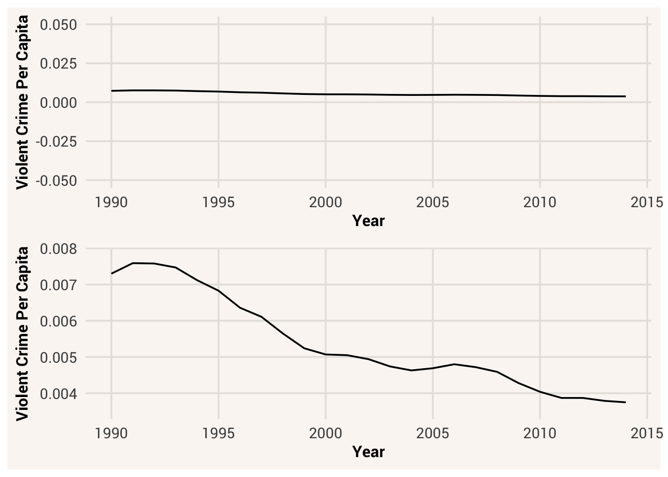
One of the major controversies in statistical data visualization is how to choose the axis bounds. Some people argue that the axes should always include 0. Others argue against this, saying that one should not spend a lot of empty space trying to reach down to the zero point at the cost of hiding what is going on in the range of the data.
There are certainly cases where using the zero point makes no sense at all. Let’s plot the Hand and Height variables in a scatter plot, with and without zero in the axes. To change the axis bounds of a plot, we add a new plot layer using the coord_cartesian() function that includes pairs of values for the min and max of each axis.
Plotting these data with zero in the axes wastes a lot of space in the figure, given that no one is going to have a height and hand length of 03. By including zero, we are also squishing down the variance within the variables and making it difficult to see the association between them.
However, it can be manipulative to go in the opposite direction and focus in on the axis scale so much that small differences in values look massive. Let’s take a look at the number of students in the dataset that identify as Asian or Latino. First we’ll filter down the dataset to focus on just those values in the variable Ethnicity, and then plot them in a bar plot.
Based on the size of the bars, it looks like there are a fairly similar number of students with each ethnicity. However, we can make it look like there are many more Asian students than Latino students by changing the y-axis:
Of course, if we actually look at the y-axis values, the difference in numbers didn’t change. But it’s difficult to override our initial reaction to seeing differently-sized bars, so the first impression of this graph is “there are many more Asian students than Latino.” You can imagine the narratives that can be spawned on social media just from a quick glance at a picture.
To avoid wasting too much white space or misleading your audience with exaggerated differences, a good starting place is to use axis ranges that encompass the full range of your raw data but not much more.
7.5 Label the data
Often in datasets you work with, variables will be given shorthand names that make them easier to type in code. If you then use them to make a plot, that variable name will be used as the label on the axis:
In this graph, without knowing much about the study the data came from, can you be sure what “StatsBeliefs” or “StatsEmotions” mean? Even if you know this is a survey of students in a statistics class, do you know what specific belief or emotion these variables measure?
If you’re writing a research paper with this data, someone could read the text elsewhere in your paper to know what the variable names mean. But why make them work so hard and risk them not understanding? It’s important to label the axes in your plots with readable names that communicate important information about the variable by just looking at the image.
We could address this problem by renaming the variables in the dataset during data cleaning. Alternatively, we can simply add informative labels to a plot. This again involves adding a plot layer. This time, we use the labs() function to add labels.
Next, notice the values on the axes. By default they’re put in alphabetical order. But these variables are ordinal and thus the levels should have a specific order. We should recode this variable to enforce this order. We can do this using the factor() function, which creates a specific kind of character data that has ordering information called “levels”. We implement this in the first step of the code below. The levels = argument in factor() takes a vector specifying which value should come first, second, etc.
We could also choose to modify the title, subtitle, caption, and legend label of this graph. This is helpful for communicating what the main message of the plot is supposed to be and what the variables mean if there’s still more to say about them.
TipExercise
Put in meaningful text to each aspect of the plot.
7.6 Remember the limits of human perception
Humans have both perceptual and cognitive limitations that can make some visualizations more difficult to understand.
7.6.1 Color
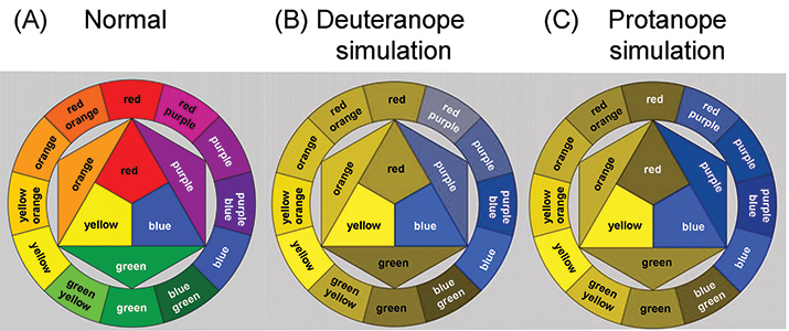
One important perceptual limitation is our ability to see color. While human vision is pretty acute compared to many other species, that doesn’t mean it is always easy to tell the difference between colors that are very similar. In addition, 8% of men and 0.5% of women are colorblind. This can make it very difficult to perceive the information in a figure if there is not an appropriate level of color and brightness contrast.
Remember when we changed the colors of our histogram in Section 7.2?
If we only tell ggplot to fill the bars with different colors based on Sex, it will pick default colors to use. These colors are the defaults because they have good contrast and are vetted for being colorblind-friendly.
It’s possible to choose our own colors for the plots. In that case, we would add a layer with scale_fill_manual() to manually specify the colors we want to use:
We can write some color names with strings, or we can exert finer control over the colors by using the hexadecimal color code system. This is a six-digit code that represents the amount of red, green, and blue in a color as well as its brightness. Using the hex color code system gives you many more color options, which you can explore in a color picker tool like this.
You can use these codes in the place of “orange” or “purple” in scale_fill_manual() to give you access to all possible colors. For instance, here are the first two colors of the plot theme used throughout this book:
While choosing hex colors yourself gives you a lot of control, it is effortful to ensure their contrast is perceptually different enough4. Rules to follow when picking colors:
- For sequential data (ordered values running low to high): use one hue that ramps light to dark, so that dark = more. Don’t use a rainbow series, because the brightness of rainbow colors fluctuates and makes a center value look bigger.
- For diverging data (ordered values with a meaningful 0 midpoint): use two sequential ramping hues meeting at a neutral midpoint
- For categorical data (unordered values): use distinct hues that are of similar lightness, so that no group looks bigger than the other.
A plot like below would not be effective because someone with color blindness (or even someone with a different brightness setting on their computer monitor) would not be able to easily tell the difference between the categories:
If you’d like to use more interesting colors in your plot but don’t want to spend effort picking them yourself, many people have created different color palettes that you can download as additional R packages.
7.6.2 Shape sizes
Other perceptual limitations apply to how we perceive quantities and sizes of shapes. For instance, look at the plot in Figure 7.4 below:
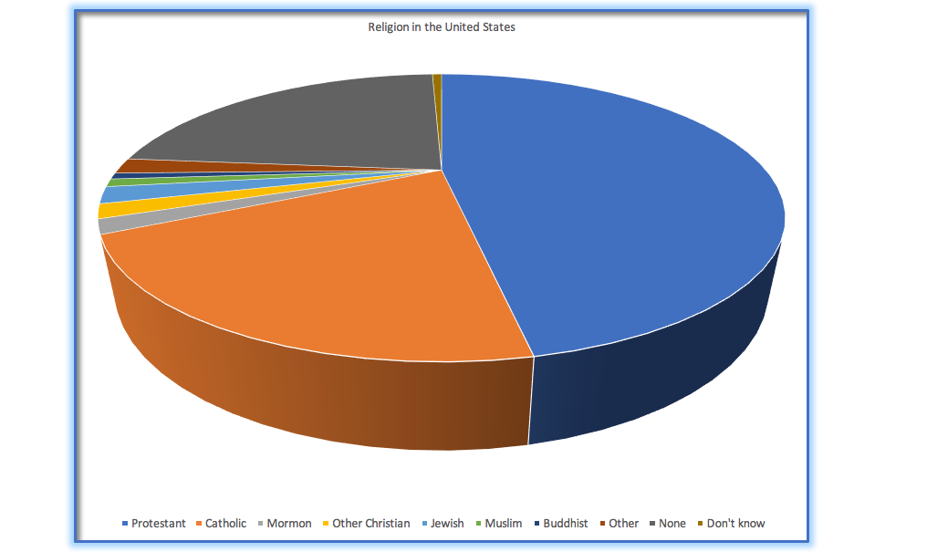
This plot is terrible for several reasons. First, it is difficult to accurately perceive differences in the volume of shapes like pie wedges. Second, the 3D perspective distorts the relative volumes further, such that it’s hard to tell if something like Catholic is bigger or smaller than Nothing in particular (they’re actually the same value, 19%). Third, the large number of categories mean that the small ones are given almost no space in the graph, making it hard to refer to them.
This is a more reasonable approach:
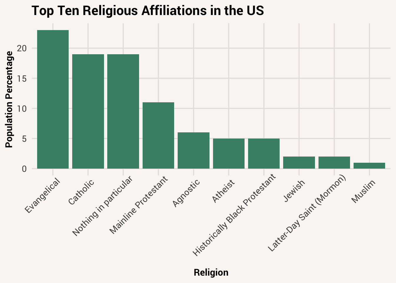
In Figure 7.5 we can see the pattern much more clearly. This plot allows the viewer to make comparisons based on just one feature - the the height of the bars. Humans tend to be more accurate when decoding differences this way vs. using area or volume. This plot may not look as flashy as the 3D pie chart, but it’s a much more effective representation of the data.
That said, there is some evidence that flashy plots are better for memory. You just want to be careful that your viewers are remembering the right things! For more resources on customizing plots so that they’re both eye-catching and communicative, check out Wickham et al. (2023) and r-graph-gallery.
7.7 Chapter resources
7.7.1 Learning goals
After reading this chapter, you should be able to:
- Write the results of descriptive statistics in APA-style
- Identify and produce bar graphs, boxplots, and faceted histograms with code
- Explain why we should show the data, not distort the data, add labels, and remember human perceptual limitations when making plots
- Layer data points on top of other plot types
- Change the color, size, transparency, and jitter of data points in R plots
- Change axis limits, labels, and titles in R plots
7.7.2 New concepts
- bar graph: a type of data visualization that plots values of a categorical variable on the x-axis and number of data points in each category on the y-axis.
- boxplot: a type of data visualization that shows the distribution of a numeric variable for different categories of a categorical variable.
- faceting: in data visualization, splitting a plot into multiple plots based on the values of some variable.
- jittering: displaying data points in a plot in slightly different positions in order to visualize them better.
7.7.3 New R functionality
7.7.4 Further reading
Wickham, Hadley, Danielle Navarro, and Thomas L. Pedersen. 2023. Ggplot2: Elegant Graphics for Data Analysis (3e). Https://ggplot2-book.org/; Springer.
Even though they will be very important to us later when choosing what additional kinds of analyses to do.↩︎
Sometimes this type of plot is also called a box-and-whisker plot because of these lines.↩︎
Well, technically someone could be missing a hand. But maybe that should be an NA value instead…↩︎
Here is a good guide for how to pick perceptually effective colors.↩︎